
Color management premiere pro что это
Узнайте о возможностях и принципах управления цветом в Premiere Pro.
Функция управления цветом помогает согласовать воспроизведение цветов на цифровых камерах, сканерах, мониторах компьютеров и принтерах. Каждое из этих устройств отображает различный диапазон цветов, который называется цветовым охватом.
При переносе медиаданных с цифровой камеры на монитор цвета меняются. Это изменение связано с тем, что у каждого устройства цветовой охват отличается, поэтому оно отображает цвета по-разному.
Функция управления цветом преобразует цвета медиаданных так, чтобы каждое устройство могло отображать их одинаково. Цвета, которые вы видите на мониторе, приближены к цветам на печатном изображении. Не все цвета в точности совпадают, потому что принтер не может воспроизвести ту же палитру цветов, что и монитор.
Чтобы настроить функцию управления цветом, выполните описанные ниже действия.
Выберите Изменить > Установки > Общие .
Выберите Управление цветом дисплея (требуется ускорение с использованием ГП) в диалоговом окне «Установки».

Если вариант Управление цветом дисплея (требуется ускорение с использованием ГП) неактивен, выполните описанные ниже действия.
Выберите Файл > Настройки проекта > Общие
В диалоговом окне «Настройки проекта» откройте раздел Рендеринг и воспроизведение видео и выберите для параметра Средство рендеринга значение Только программное ускорение ядра Mercury Playback .
Если вариант «Средство рендеринга» неактивен:
- Проверьте объем видеопамяти своего графического процессора. Чтобы программа Premiere Pro могла обнаружить графический процессор, объем видеопамяти должен превышать 1 ГБ.
- Проверьте версии драйверов графического процессора. Если они устарели, возможно, понадобится установить новые версии драйверов с веб-сайта производителя (только для Windows).

Функция управления цветом в Premiere Pro вносит изменения в проект, чтобы правильно отобразить цвета на дисплее с цветовым охватом P3 и sRGB.
Функцию «Управление цветом» следует включать, когда требуется, чтобы на контрольном мониторе цветопередача совпадала с изображением на таймлайне. Отключите функцию «Управление цветом», если экран соответствует объекту на таймлайне. Этот вариант подходит для отображения в цветовых пространствах Rec. 709 и sRGB, а также в социальных сетях.
Инструкции по включению и отключению функции «Управление цветом» см. в таблице ниже.
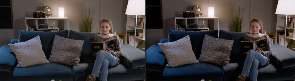
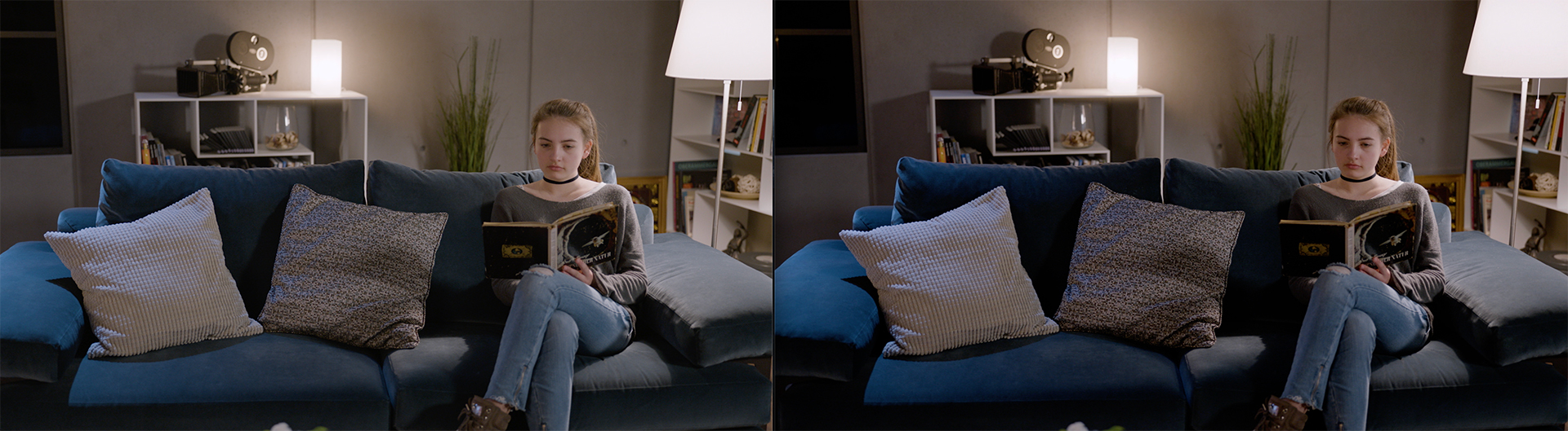
Изображение, когда функция управления цветом отключена
Изображение, когда функция управления цветом включена
Изображение нормальное, но не требуется
Изображение слишком насыщенное
Насыщенность изображения немного снижена. Изображение соответствует тому, что видят зрители YouTube на дисплее sRGB.
Полутона соответствуют цветовому пространству Rec. 709. Некоторые детали в темных участках не отображаются*
Функция управления цветом изображения применяется как на основном, так и на дополнительном мониторе компьютера как составная часть его ОС. Она показывает точные цвета и уровень контрастности, которые необходимы для калибровки дисплея или определения его характеристик.
На большинстве компьютерных экранов используется цветовое пространство sRGB. А на некоторых новых моделях дисплеев — цветовое пространство P3 (например, дисплеях Retina на iMac и DreamColor от HP) или другие виды расширенного цветового охвата.
На контрольных видеомониторах используется цветовое пространство Rec. 709. Некоторые дисплеи (например, DreamColor от HP) могут отображать несколько стандартов: sRGB, Rec. 709 и P3.
Чаще всего пользователи редактируют в цветовом пространстве Rec. 709, потому что это стандартный тип монитора. Это создает проблему, потому что большинство видео отображаются в цветовом пространстве Rec. 709. Если включить функцию «Управление цветом», изображение на видео в Rec. 709 будет казаться ближе, чем на контрольном видеомониторе. Кроме того, на дисплее будет заметно снижение качества.
Некоторые видеокарты используют округление до ближайшего целого в меньшую сторону вместо округления до ближайшего целого, поэтому:
Многие дисплеи только называются sRGB (дисплеи SINO). Несмотря на калибровку по стандарту sRGB, дисплей SINO может быть неточным, так как большинство инструментов калибровки отбирают мало образцов. То есть на дисплее SINO отображается меньше деталей, чем в кодировке sRGB.
Независимо от того, как вы настроите функцию управления цветом дисплея, уровень детализации немного снизится. На дисплее sRGB невозможно точно отобразить цвета палитры Rec. 709.
Если вы собираетесь публиковать видео на видеоканале в Интернете (например, YouTube, Facebook или Vimeo) или воспроизводить на дисплее sRGB, включать функцию управления цветом дисплея не стоит. Если это видео будут показывать на телевидении, то функцию управления цветом дисплея имеет смысл включить.
Ниже показаны несколько снимков экрана, сделанных на мониторе sRGB, показывающем видео Rec. 709 с включенной и отключенной функцией управления цветом дисплея. Видна разница в отображении теней и насыщенности.


В этом видеоруководстве объясняется, как настроить функцию управления цветом в Premiere Pro на MacOS и Windows.
Время просмотра: 7 минут.
Learn about color management and how it works in Premiere Pro.
Color management helps you to achieve consistent color among digital cameras, scanners, computer monitors, and printers. Each of these devices reproduces a different range of colors, called a color gamut.
As you move media from your digital camera to your monitor, the colors shift. This shift occurs because every device has a different color gamut and thus reproduces the colors differently.
Color management translates the media colors so that each device can reproduce them in the same way. The colors that you see on your monitor are close to the colors in your printed image. All colors may not match exactly because the printer may not reproduce the same range of colors as the monitor.
To set up color management, do the following:
Select Edit > Preferences > General .
Select Enable Display Color Management (requires GPU acceleration) from the Preferences dialog box.

If Enable Display Color Management (requires GPU acceleration) is dimmed, do the following:
Select File > Project Settings > General
Under Video Rendering and Playback in the Project settings dialog box, set the Renderer to Mercury Playback Engine Software Only .
If the Renderer is grayed out:
- Check the VRAM of your GPU. The VRAM should be more than 1 GB for Premiere Pro to detect the GPU.
- Check if your GPUs are current. They may be oudated and you may need to update your drivers from the manufacturer's website (Windows only).
For more information on Premiere Pro and GPU, see GPU and GPU Driver Requirements for Premiere Pro.

Color management in Premiere Pro affects a project by displaying colors correctly while using a gamut P3 display and a sRGB display.
Color management does not correct the color and contrast on your YouTube videos. It also cannot help fix Gamma Issues where the footage looks washed out after exporting it from Premiere Pro or Adobe Media Encoder. For more information on this issue, see The QuickTime Gamma Bug.
Enabling color management is useful when you want to display the color appearance of a timeline on a reference monitor. Disabling color management is useful when your screen matches the media on the timeline. It works well for Rec. 709, sRGB, and social media delivery.
To enable or disable color management, use the following table:
Display when color management is disabled
Display when color management is enabled
Display is fine
Display is fine, but it is not required
Display is too saturated
Display is fine
Display is slightly washed out. Matches what YouTube viewers see on their sRGB display.
Mid Tones match Rec. 709. Some shadow details might be lost*
Display Color Management works for both internal and secondary computer monitors used as part of the OS desktop. It shows the accurate colors and contrast that are required for your display to be calibrated or characterized.
Most computer screens are sRGB. Some newer displays are P3 (like the iMac Retina displays and HP’s DreamColor displays) or some other wide gamut color space.
Broadcast Monitors are Rec. 709. Some displays, like the DreamColor displays from HP, can show multiple standards: sRGB, Rec. 709, P3.
Most people edit on Rec. 709 because it is a common monitor. It is problematic because most videos are Rec. 709. Enabling color management makes the Rec. 709 video appear closer than a broadcast monitor. There is also loss of quality in the display.
Some video cards use floor instead of round, so:
Many displays are “sRGB-in-name-only”, SINO. Although calibrated to sRGB, a SINO display can be off target, since most calibration tools take few samples. So, a SINO display shows fewer details than what is represented in a sRGB encoding.
There is some loss of detail regardless of how you set Display Color Management. Your sRGB display will never be able to show true Rec. 709.
If the destination for your video is an online video channel such as YouTube, Facebook, Vimeo, or played back on an sRGB display, you must not turn on Display Color Management. If the destination for your video is a broadcaster, you can turn on Display Color Management.
Here are some screens grabs from an sRGB monitor, showing Rec. 709 video, with Display Color Management enabled and disabled. The difference is in the shadows and saturation.


Watch this tutorial to understand how to set up color management in Premiere Pro on macOS and Windows.
Viewing time: 7 minutes.
Learn about color management and how it works in Premiere Pro.
Color management helps you to achieve consistent color among digital cameras, scanners, computer monitors, and printers. Each of these devices reproduces a different range of colors, called a color gamut.
As you move media from your digital camera to your monitor, the colors shift. This shift occurs because every device has a different color gamut and thus reproduces the colors differently.
Color management translates the media colors so that each device can reproduce them in the same way. The colors that you see on your monitor are close to the colors in your printed image. All colors may not match exactly because the printer may not reproduce the same range of colors as the monitor.
To set up color management, do the following:
Select Edit > Preferences > General .
Select Enable Display Color Management (requires GPU acceleration) from the Preferences dialog box.
If Enable Display Color Management (requires GPU acceleration) is dimmed, do the following:
Select File > Project Settings > General
Under Video Rendering and Playback in the Project settings dialog box, set the Renderer to Mercury Playback Engine Software Only .
If the Renderer is grayed out:
- Check the VRAM of your GPU. The VRAM should be more than 1 GB for Premiere Pro to detect the GPU.
- Check if your GPUs are current. They may be oudated and you may need to update your drivers from the manufacturer's website (Windows only).
For more information on Premiere Pro and GPU, see GPU and GPU Driver Requirements for Premiere Pro.
Color management in Premiere Pro affects a project by displaying colors correctly while using a gamut P3 display and a sRGB display.
Color management does not correct the color and contrast on your YouTube videos. It also cannot help fix Gamma Issues where the footage looks washed out after exporting it from Premiere Pro or Adobe Media Encoder. For more information on this issue, see The QuickTime Gamma Bug.
Enabling color management is useful when you want to display the color appearance of a timeline on a reference monitor. Disabling color management is useful when your screen matches the media on the timeline. It works well for Rec. 709, sRGB, and social media delivery.
To enable or disable color management, use the following table:
Display when color management is disabled
Display when color management is enabled
Display is fine
Display is fine, but it is not required
Display is too saturated
Display is fine
Display is slightly washed out. Matches what YouTube viewers see on their sRGB display.
Mid Tones match Rec. 709. Some shadow details might be lost*
Display Color Management works for both internal and secondary computer monitors used as part of the OS desktop. It shows the accurate colors and contrast that are required for your display to be calibrated or characterized.
Most computer screens are sRGB. Some newer displays are P3 (like the iMac Retina displays and HP’s DreamColor displays) or some other wide gamut color space.
Broadcast Monitors are Rec. 709. Some displays, like the DreamColor displays from HP, can show multiple standards: sRGB, Rec. 709, P3.
Most people edit on Rec. 709 because it is a common monitor. It is problematic because most videos are Rec. 709. Enabling color management makes the Rec. 709 video appear closer than a broadcast monitor. There is also loss of quality in the display.
Some video cards use floor instead of round, so:
Many displays are “sRGB-in-name-only”, SINO. Although calibrated to sRGB, a SINO display can be off target, since most calibration tools take few samples. So, a SINO display shows fewer details than what is represented in a sRGB encoding.
There is some loss of detail regardless of how you set Display Color Management. Your sRGB display will never be able to show true Rec. 709.
If the destination for your video is an online video channel such as YouTube, Facebook, Vimeo, or played back on an sRGB display, you must not turn on Display Color Management. If the destination for your video is a broadcaster, you can turn on Display Color Management.
Here are some screens grabs from an sRGB monitor, showing Rec. 709 video, with Display Color Management enabled and disabled. The difference is in the shadows and saturation.
Watch this tutorial to understand how to set up color management in Premiere Pro on macOS and Windows.
Viewing time: 7 minutes.
Learn about color management and how it works in Premiere Pro.
Color management helps you to achieve consistent color among digital cameras, scanners, and computer monitors. Each of these devices reproduces a different range of colors, called a color gamut.
As you move media from your digital camera to your monitor, the colors shift. This shift occurs because every device has a different color gamut and thus reproduces the colors differently. For example, the colors on one frame of a video appear the same on a computer LCD monitor and a plasma screen. All the colors may not match exactly because each device has a different range of color intensities. Color management translates the media colors so that each device can reproduce them in the same way.
To set up color management, do the following:
Select Edit > Preferences > General .
Select Enable Display Color Management (requires GPU acceleration) from the Preferences dialog box.
If Enable Display Color Management (requires GPU acceleration) is dimmed, do the following:
Select File > Project Settings > General
Under Video Rendering and Playback in the Project settings dialog box, set the Renderer to Mercury Playback Engine GPU Acceleration .
If the Renderer is grayed out:
- Check the VRAM of your GPU. The VRAM should be more than 1 GB for Premiere Pro to detect the GPU.
- Check if your GPUs are current. They may be oudated and you may need to update your drivers from the manufacturer's website (Windows only).
For more information on Premiere Pro and GPU, see GPU and GPU Driver Requirements for Premiere Pro.
Color management in Premiere Pro affects a project by displaying colors correctly while using a gamut P3 display and a sRGB display.
Color management does not correct the color and contrast on your YouTube videos. It also cannot help fix Gamma Issues where the footage looks washed out after exporting it from Premiere Pro or Adobe Media Encoder. For more information on this issue, see The QuickTime Gamma Bug.
Enabling color management is useful when you want to display the color appearance of a timeline on a reference monitor. Disabling color management is useful when your screen matches the media on the timeline. It works well for Rec. 709, sRGB, and social media delivery.
To enable or disable color management, use the following table:
Display when color management is disabled
Display when color management is enabled
Display is fine
Display is fine, but it is not required
Display is too saturated
Display is fine
Display is slightly washed out. Matches what YouTube viewers see on their sRGB display.
Mid Tones match Rec. 709. Some shadow details might be lost*
Display Color Management works for both internal and secondary computer monitors used as part of the OS desktop. It shows the accurate colors and contrast that are required for your display to be calibrated or characterized.
Most computer screens are sRGB. Some newer displays are P3 (like the iMac Retina displays and HP’s DreamColor displays) or some other wide gamut color space.
Broadcast Monitors are Rec. 709. Some displays, like the DreamColor displays from HP, can show multiple standards: sRGB, Rec. 709, P3.
Most people edit on Rec. 709 because it is a common monitor. It is problematic because most videos are Rec. 709. Enabling color management makes the Rec. 709 video appear closer than a broadcast monitor. There is also loss of quality in the display.
Some video cards use floor instead of round, so:
Many displays are “sRGB-in-name-only”, SINO. Although calibrated to sRGB, a SINO display can be off target, since most calibration tools take few samples. So, a SINO display shows fewer details than what is represented in a sRGB encoding.
There is some loss of detail regardless of how you set Display Color Management. Your sRGB display will never be able to show true Rec. 709.
If the destination for your video is an online video channel such as YouTube, Facebook, Vimeo, or played back on an sRGB display, you must not turn on Display Color Management. If the destination for your video is a broadcaster, you can turn on Display Color Management.
Here are some screens grabs from an sRGB monitor, showing Rec. 709 video, with Display Color Management enabled and disabled. The difference is in the shadows and saturation.
Watch this tutorial to understand how to set up color management in Premiere Pro on macOS and Windows.
Viewing time: 7 minutes.
Does your footage appear different when you export it from Premiere Pro? Come to the community for some real-life examples and solutions.
What are those “Quicktime gamma” shifts everyone talks about and how can you address them?
Read through any of the online forums and you’ll often see this common concern: “Why doesn’t my export look the same in QuickTime as it does in Premiere Pro?” This tends to be more common with Mac users than PC users, but it happens with Windows, too. The underlying assumption that they should match is a fallacy and I’ll explain why in this article. This is a companion piece to another article Trusting Apple Displays looking at some of the display options and settings available in Apple devices from iMacs to iPads.
Let’s start with displays
If you line up a CRT monitor, an older flat-panel plasma, and newer LCD, LED, and OLED displays, then you would be very hard-pressed to get the same image to match identically across all displays, even with calibration. The physics and technological design of each means they will render images differently. A color bar test pattern may match, but a series of organic, real-world images won’t. This is why veteran editors and colorists have long maintained two rules – only have one color display in the room and stick to one, consistent reference monitor for all projects.
Adobe Premiere Pro’s working color space
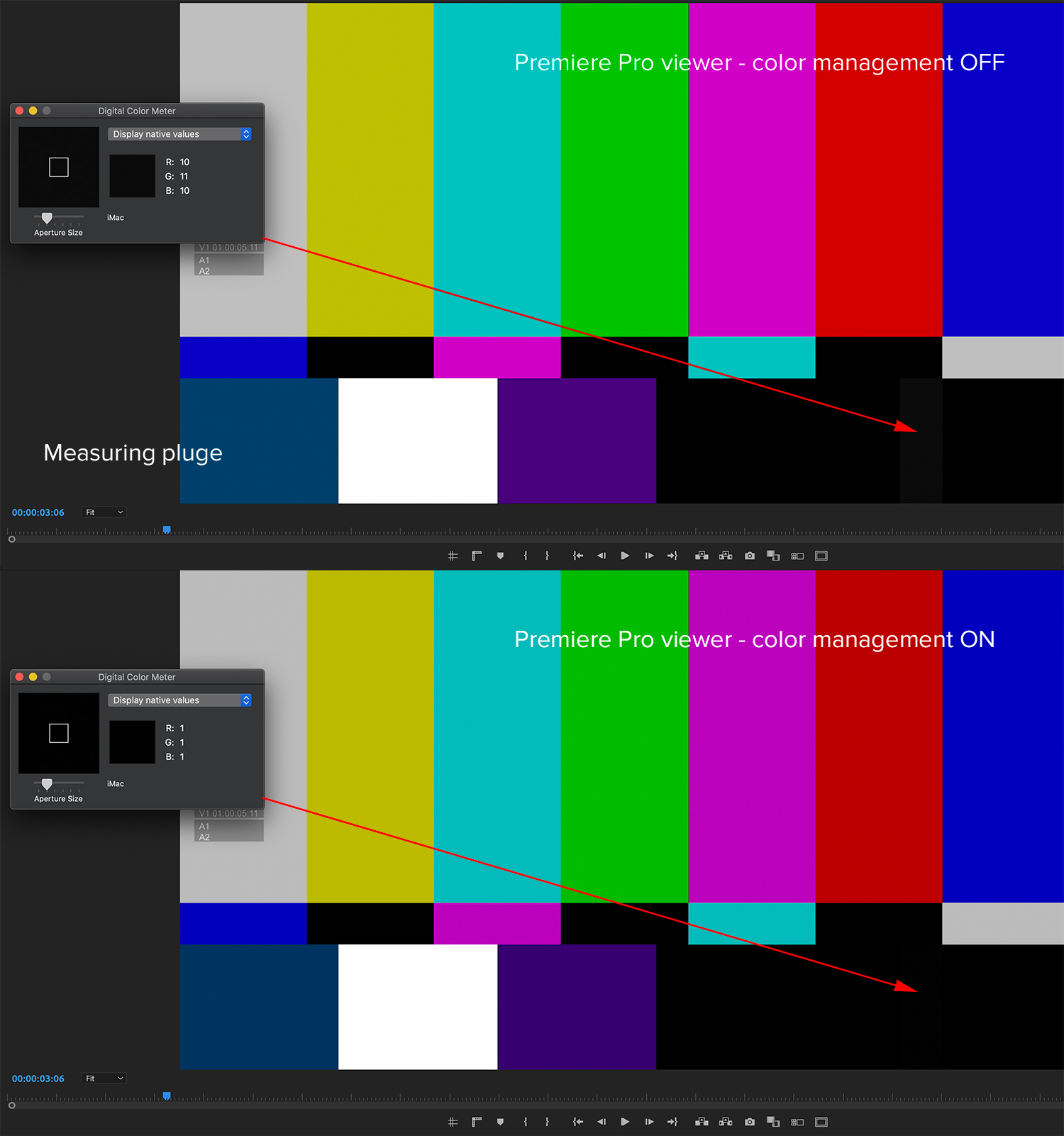
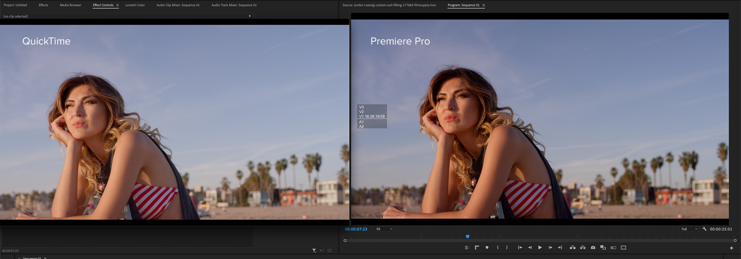
SDR sequences in Premiere Pro are designed to use Rec 709, 2.4 gamma as the working color space for the timeline and viewer. There’s a preference toggle for display color management to compensate for the interface display that you are using. If you are working on an iMac, then the display is using the P3 color space, which tends to accentuate reds and general saturation. With this color management setting OFF, the brightness and contrast of the image in the viewer will be a close match to both Rec 709 on an external video display, as well as to the exported file viewed in QuickTime. But the image will appear too saturated in the viewer, especially with any red tones. Hence, the common complaint that my files look “washed out” after export.
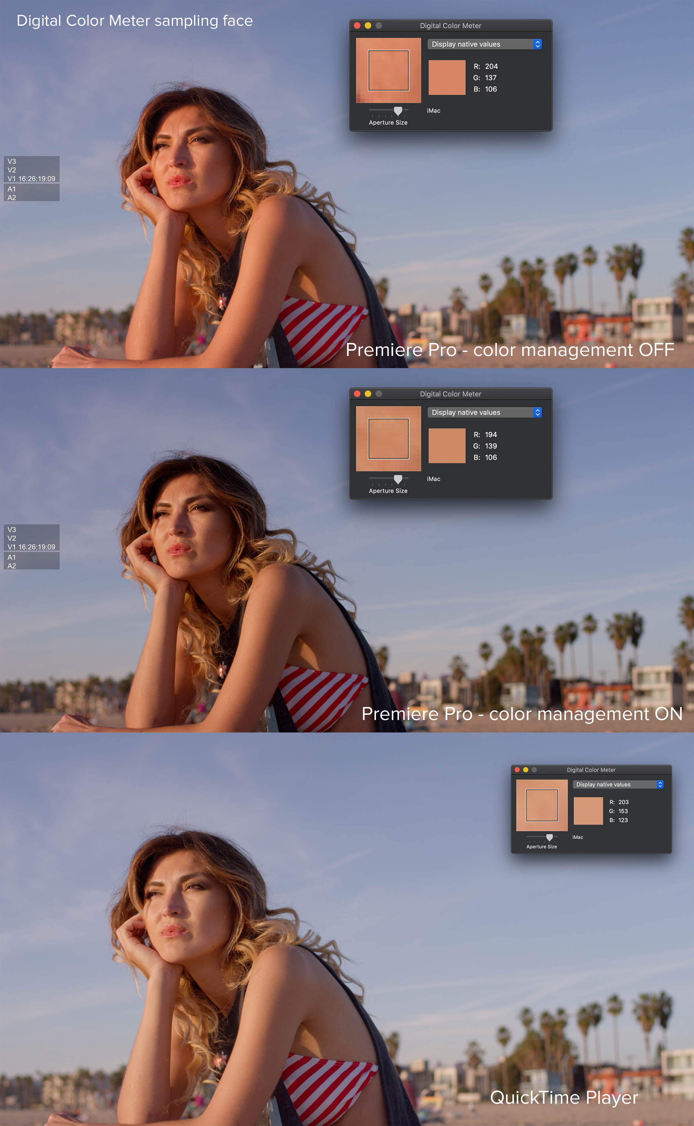
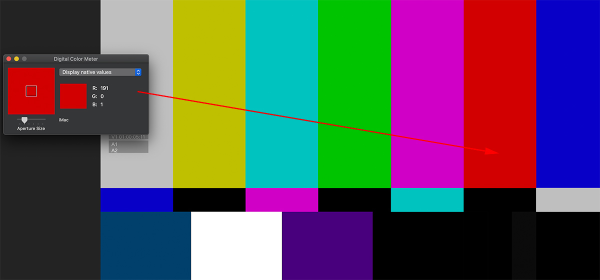
With color management ON, the viewer image will have the closest saturation match to what you see on a display, but shadow detail will be somewhat “crushed.” This is evident when you look at the near-black pluge patch on a color bar chart. Apple includes a handy Digital Color Meter utility that can be used to measure the RGB values anywhere on the screen. Remember that how an image appear in the viewer to your eye is subject to the brightness adjustment of your computer display.
The world of Apple displays
If you are working on a newer Apple iMac, iMac Pro, or Pro Display XDR, then you are using an image system calibrated for a different display profile. iMacs use the P3 D-65 color standard with the ability to go up to 500 nits of brightness (traditionally SDR maxes out at 100 nits). P3 encompasses a wider color space than Rec 709. Furthermore, the Pro Display XDR features an extended dynamic range intended for HDR (high dynamic range) signals. As Stu Maschwitz has noted in his Prolost blog, Apple is also using some “secret sauce” to accommodate the appearance of HDR content on displays that are technically not HDR (defined as 1,000 nits or higher).
The only consistent reference you will ever have is how the image appears through AJA or Blackmagic i/o hardware to a reference display. How does all of this apply to what you see in your editing software and your video files? Of the four leading NLEs (Media Composer, Premiere Pro, Final Cut Pro, and DaVinci Resolve) none can faithfully produce a perfect match when comparing the viewer image to the image on the monitor nor an exported movie file played through QuickTime, VLC, or Switch. I’ve found the closest to be Final Cut Pro, which is likely due to Apple’s “secret sauce” when using their displays. However, even if the movie export doesn’t match the viewer, it should look identical on the external video monitor when you play that file using Blackmagic’s or AJA’s standalone player utility. It’s purely an interface display difference and not a problem with any video processing.
Solving the problem?
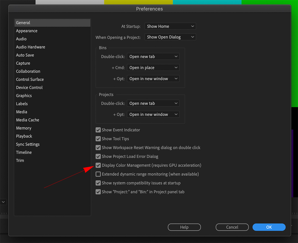
My recommendation is to turn display color management ON in the Premiere Pro preferences. This gives you a proper visual match between the timeline and the output to a reference display. Unfortunately this leaves you with the dilemma of the exported file.
Whether the appearance is a distraction for you depends on several factors. If you aren’t particularly sensitize to these differences, then it doesn’t matter. Also, an image that doesn’t have a lot of saturation in the midrange to begin with, won’t show as great of a difference anyway. But if it does bother you – or if you want to be visually accurate to your viewer – then there are a couple of solutions. If you are delivering for broadcast and web use, you may actually need to export two different files – each optimized for a different destination.
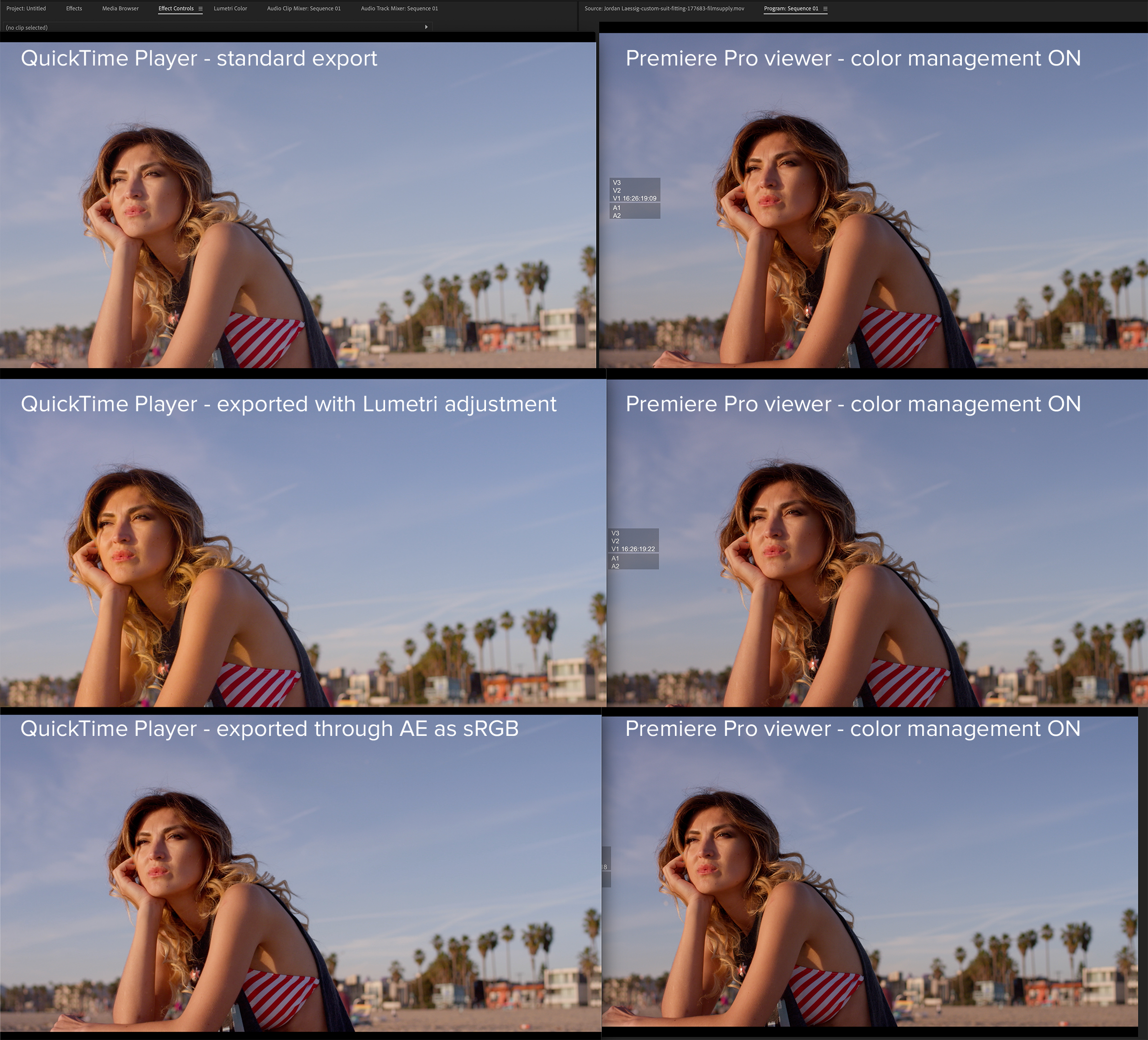
I’ve tested some of the export LUTs that are intended for gamma correction. I find that they don’t work well. The simplest answer is to first export a “standard” file for broadcast use. Then add an adjustment layer to your Premiere Pro sequence and apply a Lumetri effect to it. Increase saturation and lower shadows slightly. Test to taste. Export that as your web file. This should be a reasonable match in Quicktime to what you’ve been seeing in the Premiere Pro viewer while editing (prior to adding the adjustment layer and Lumetri tweak).
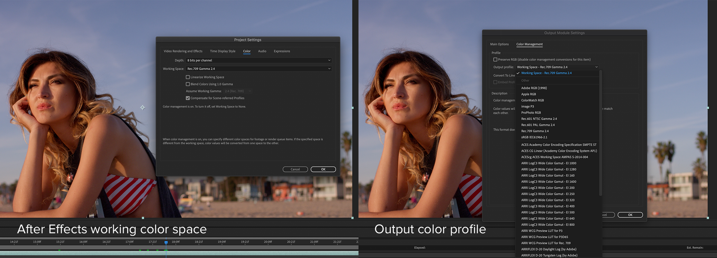
An alternative is to use After Effects, which differentiates between the working color space and the export color profile. In this application, bring the “standard” file that you exported from Premiere into After Effects as a new composition. Your working color space should be set to Rec 709, 2.4 gamma. In the render queue, change the color profile to sRGB. This exported file will look very close in QuickTime (or any other media player) to the image you see in your Premiere Pro viewer.
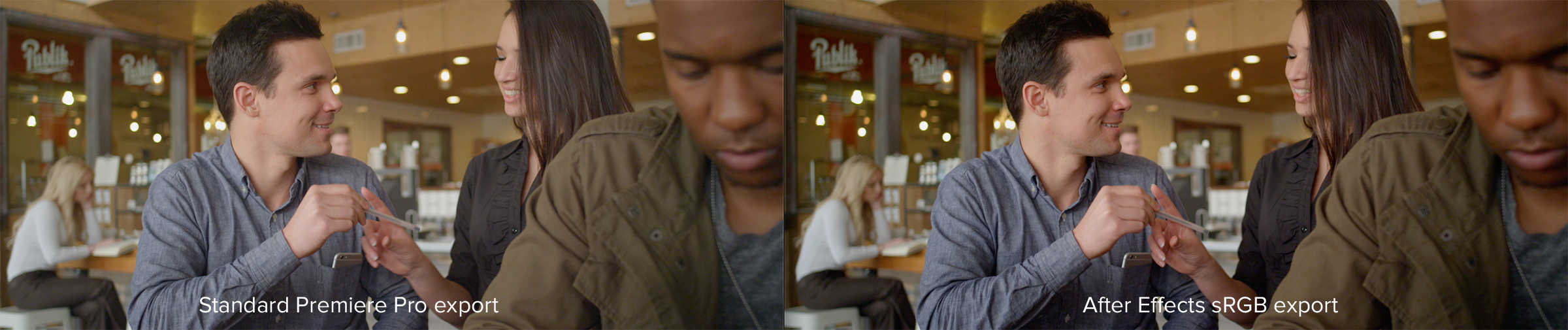
These two solutions are meant only for final export, because the custom file settings will not match the original files if you were to re-import them into Premiere Pro. While these methods might seem convoluted, they are the only solutions I’ve found to date that solve the problem, if in fact, such minor differences bother you in the first place. Ultimately, your video will most likely go to some web platform, like Vimeo or YouTube, where additional changes happen. There are only so many things you can control. Hopefully this article has offered some insight and potential remedies.
Читайте также: