
Как подключить бутстрап к visual studio
Это лишь вопрос времени, когда какой-нибудь пользователь наберет URL вашего сайте на своем мобильном устройстве. Обнаружит ли этот пользователь, что пользоваться вашим сайтом со смартфона невозможно из-за того, что он рассчитан только на настольные системы? Если да, он скорее всего отправится на более дружественный к мобильным устройствам сайт.
В прошлом веб-сайт, который поддерживал мобильные и настольные браузеры, требовал создания разных кодовых баз. Но сегодня существуют инфраструктуры UI, позволяющие веб-страницам сайта поддерживать смартфоны, планшеты, лэптопы и даже настольные компьютеры с большими экранами на основе единой кодовой базы. Хотя эти средства не являются панацеей для веб-разработчиков мобильных приложений, они способны значительно облегчить процесс разработки. Тем не менее, нужно тщательно продумывать, годится ли конкретная инфраструктура для вашего сайта.
В этой статье дан обзор одной из таких инфраструктур, Bootstrap, включенной во многие шаблоны проектов Web Application в Visual Studio 2013. Bootstrap — это инфраструктура, поддерживающая адаптивный веб-дизайн (responsive Web design, RWD) — такой подход к проектированию веб-сайтов, который обеспечивает приемлемое зрительное восприятие на устройствах всех форм-факторов с помощью единой кодовой базы. После обзора я рассмотрю некоторые факторы, которые могут помочь решить, подходит ли для вашего сайта инфраструктура вроде Bootstrap.
Начало всех начал
Потребовался определенный виток эволюции, чтобы индустрия программного обеспечения вышла в ту точку, где появляются решения вроде Bootstrap. После фальстарта в 1998 году, когда сначала появлялись, а потом исчезали Wireless Markup Language (WML), Compact HTML и XHTML Mobile Profile, в 2009 году HTML5 наконец стал стандартом HTML нового поколения для всех устройств. Но одних стандартов не достаточно. Пока шло развитие стандарта для веб-разметки на мобильных устройствах, были достигнуты значительные успехи в аппаратном обеспечении, мобильных браузерах и пропускной способности сетей. Процессоры стали быстрее, мобильные браузеры продвинулись до такого состояния, что могли отображать любую веб-страницу (даже если страница не была рассчитана на мобильное устройство). Это создало новую среду для разработчиков.
Что такое Bootstrap?
Bootstrap — инфраструктура адаптивных UI для веб-сайтов. Она, как и многие другие инфраструктуры UI для веб-разработки, является набором CSS-классов, UI-компонентов и JQuery-плагинов. Bootstrap считается облегченной инфраструктурой. Иначе говоря, для выполнения своей работы она использует CSS больше, чем JavaScript. Хотя Bootstrap считается облегченной, веб-страница, использующая инструментарий Bootstrap, все равно требует больше обработки для рендеринга по сравнению со страницей, написанной специально для данного форм-фактора. По этой причине производительность должна быть важным фактором при проектировании, разработке и тестировании страниц, использующих любую часть инфраструктуры Bootstrap.
Если вы предпочитаете использовать новейшие версии Bootstrap и JQuery, обновляйте свой проект с помощью NuGet.
Bootstrap многое делает за вас автоматически. Она также позволяет легко адаптировать поведение по умолчанию для конкретного форм-фактора, в то же время сохраняя хороший вид вашей страницы на других форм-факторах. Bootstrap версии 3 поставляется с CSS-классами, специально ориентированными на те размеры экранов, с которыми имеют дело мобильные, планшетные, настольные браузеры и даже браузеры на ПК с очень большими экранами. Вы можете использовать CSS-классы Bootstrap для аннотирования HTML5-элементов. К числу наиболее часто применяемых CSS-классов относится сетчатая система (grid system) в Bootstrap — набор классов, организующих разметку страницы с использованием строк и столбцов. Я опишу эту систему подробнее далее в этой статье.
В Bootstrap есть ряд UI-компонентов для создания UI сайта, включая раскрывающееся меню кнопки (Button dropdown), группу Button, раскрывающийся список (Dropdown), Navbar, Breadcrumb, объект Media, панели Pagination и Progress и многие другие. Большинство этих компонентов сами являются адаптивными, т. е. они по-разному визуализируются в зависимости от ширины экрана, поддерживаемой браузером. Например, Navbar — мощный компонент, который автоматически переходит от строки меню на всю ширину экрана на настольных компьютерах, в которой показываются пункты меню, к симпатично выглядящей компактной версии, которая предоставляет пункты меню через раскрывающуюся полоску меню, активируемую касанием Navbar.
Приступаем
Эксперименты с сетчатой системой Bootstrap
Bootstrap предоставляет так называемую 12-столбчатую адаптивную разметку. Вы можете размечать свои страницы, используя любое количество строк, но должны использовать 12 столбцов. Эти 12 столбцов получают одинаковый размер по всей ширине окна браузера, и с помощью CSS-классов Bootstrap вы указываете, сколько столбцов должен занимать тот или иной HTML-элемент. Этот тип сетчатой системы отличается от той, к которой привыкли XAML-разработчики в Windows Phone и Windows 8. Сетчатая система XAML разрешает создавать в разметке страницы любое количество строк и столбцов. Разработчики помещают каждый элемент управления в ячейку, указывая номера строки и столбца. Что делает сеточную систему Bootstrap особенно мощной, так это возможность указывать разные объединения колонок (column span) для больших и обычных настольных ПК, планшетов и смартфонов. Например, распространенный шаблон разметки заключается в создании серии div, причем для каждого div указывается, что тот должен занимать два столбца на большом настольном ПК (т. е. на каждой строке умещается по шесть div), три столбца на обычном настольном ПК, четыре — на планшете и шесть — на смартфоне (с двумя div на строку). Этот сценарий кодируется на рис. 2, используя классы col*, которые составляют сеточную систему Bootstrap. Классы цветов (gray, orange и т. д.) просто окрашивают фон div. На рис. 3 и 4 показано, как эта страница будет визуализироваться на настольном ПК и смартфоне соответственно.
Рис. 2. Распространенный шаблон разметки с использованием сеточной системы Bootstrap
.jpg)
Рис. 3. Пример визуализации разметки с рис. 2 на настольном ПК, используя класс col-md-3
.jpg)
Рис. 4. Пример визуализации разметки с рис. 2 на смартфоне, используя класс col-xs-6
Важно отметить, что Bootstrap на самом деле не распознает тип устройства. Bootstrap использует media-запросы, чтобы определить, следует ли применить какой-то CSS-класс. В табл. 1 перечислены четыре категории классов наряду с диапазонами ширины, которые вызывают применение каждой из категорий.
Табл. 1. Категории классов в сеточной системе Bootstrap
| Префикс категории | Форм-фактор | Ширина в пикселях |
| col-xs-* | Смартфон | Менее 768 |
| col-sm-* | Планшет | 768–991 |
| col-md-* | Обычный настольный ПК | 992–1200 |
| col-lg-* | Большой настольный ПК | Более 1200 |
Вы можете использовать любую комбинацию этих категорий при разметке конкретного HTML-элемента. Например, следующая строка кода использует один класс из каждой категории:
Это эквивалентно следующему псевдокоду:
Вы не обязаны явно указывать счетчик столбцов для каждой категории. Если вы не задаете его для конкретной категории, будет использоваться следующая категория с меньшим размером. Например, если бы вы хотели иметь уникальную разметку для смартфонов, но пригодную для планшетов и настольных ПК (обычных и больших), то достаточно указать класс для смартфона и планшета:
Bootstrap содержит более 20 компонентов, которые можно использовать «как есть» или расширить под свои требования.
Bootstrap будет использовать настройку планшета для обоих форм-факторов настольных ПК. Кроме того, класс по умолчанию для смартфонов — col-xs-12, который помещает каждый div в свою строку. Если это приемлемая разметка для смартфона, предыдущую строку кода можно сократить до:
Заметьте, что на рис. 2 эти строки не указаны. Сеточная система Bootstrap будет автоматически смещать div в следующую строку, если текущая строка уже используется или если недостаточно места для div. Вы можете принудительно заставить использовать новую строку с помощью класса row:
Почему 12 столбцов? Может показаться, что это число было выбрано случайным образом, но это не так. Число 12 обеспечивает любую кратность деления и открывает широкий простор для сочетаемости. Например, 12 без остатка делится на 1, 2, 3, 4, 6 и 12. Используя эти значения для диапазонов столбцов, можно получать разметку контента на 12 столбцов, 6, 4, 2 и 1 соответственно. Более того, такие комбинации, как 3+9, 9+3, 4+8 и 8+4 являются визуально привлекательными для разметки контента.
Компоненты Bootstrap
Bootstrap содержит более 20 компонентов, которые можно использовать «как есть» или расширить под свои требования. Посмотрите на сайте Bootstrap описание каждого компонента и примеры их использования. В документации по объекту Media для демонстрации используется музыкальный видеоролик REO Speedwagon. Даже если вы не застали 80-е, послушать эту группу стоит.
Компонент Navbar я рассмотрю подробнее — он используется для создания строки меню вверху страницы. На рис. 5 показано, как с помощью этого компонента создать простое меню, содержащее значок сайта и несколько пунктов меню. Если ширина экрана браузера более 768 пикселей, Navbar визуализируется, как на рис. 6, а если она меньше 768 пикселей — как на рис. 7. В данном случае пункты меню отображаются, когда пользователь касается кнопки, содержащей горизонтальные линии.
Рис. 5. Использование Bootstrap-компонента Navbar
.jpg)
Рис. 6. Визуализация Navbar в браузере на экране, ширина которого больше или равна 768 пикселям
.jpg)
Рис. 7. Визуализация Navbar в браузере на экране, ширина которого меньше 768 пикселей
Очевидно, что это очень простой пример. Navbar также может содержать кнопки с раскрывающимися меню и даже включать функциональность поиска. Кроме того, Brand-часть Navbar, которая в примере является текстовой, может быть изображением.
Плагины JQuery
JavaScript, необходимый для запуска этих плагинов, находится в bootstrap.js. Каждый плагин также доступен как отдельный файл, что позволяет включать лишь те плагины, которые требуются приложению, а это ускоряет рендеринг первой страницы.
На рис. 8 показано, как использовать плагин Carousel, который предоставляет функциональность для слайд-шоу. Если в вашей странице уже есть ссылка на bootstrap.js или bootstrap.min.js, все готово. Или же можно сослаться на carousel.js, если Carousel — единственный плагин, нужный вашей странице.
Рис. 8. Использование плагина Carousel
На рис. 9 видно, как визуализируется плагин Carousel в Windows Phone. Плагин Carousel самостоятельно растягивается под форм-факторы планшетов и настольных ПК (обычных и с большими экранами).
.jpg)
Рис. 9. Пример с плагином Carousel, визуализированным в эмуляторе Windows Phone
Некоторые соображения
Как я уже говорил, Bootstrap не годится на все случаи жизни. Чтобы определить, подходит ли Bootstrap для вашего сайта, продумайте несколько соображений.
- Если у вас есть сайт, производительность которого оптимизировалась годами, и он оптимален для ваших пользователей, будьте крайне осторожны. Хорошая идея — создать прототипы сложных, часто используемых страниц. Если страница с поддержкой Bootstrap, на дает адекватной производительности, подумайте о подготовке мобильного сайта (m-site) и кодируйте все самостоятельно. В статье Дино Эспозито (Dino Esposito) «Mobilize an Existing Web Site» (bit.ly/1CaVEWR) оказано, как подготовить мобильный сайт.
- Если вы создаете новый сайт, сделайте прототипы самых сложных страниц и страниц, которые, по вашему мнению, будут использоваться наиболее часто. Убедитесь, что они хорошо работают на дешевых устройствах и в условиях малой пропускной способности сети. Если эти страницы окажутся проблематичными, попробуйте изменить их так, чтобы они работали с адекватной производительностью. Как вариант можно создать мобильный сайт, но это следует делать, только если переработка не помогла.
- Убедитесь, что сеточная система и компоненты Bootstrap, используемые для навигации, не являются слишком ограничивающими факторами в отношении дизайна сайта. На мой взгляд, инструмент подобный Bootstrap заставляет вас проектировать в расчете на мобильные устройства, что в свою очередь заставляет избегать загромождения страниц сайта.
Дополнительная информация и инструменты
Если вы собираетесь разрабатывать свой сайт с применением Bootstrap, вам стоит изучить все компоненты и плагины JQuery, документированные на сайте Bootstrap, где также имеется множество полезных примеров. Также вам следует проверить:
Убедитесь, что сеточная система и компоненты Bootstrap, используемые для навигации, не являются слишком ограничивающими факторами в отношении дизайна сайта.
Заключение
Материал, изложенный в этой статье, является лишь кратким обзором UI-инфраструктуры Bootstrap. Здесь нет полного описания всех CSS-классов, компонентов и плагинов, поставляемых с Bootstrap. Чтобы получить полное представление обо всех доступных средствах и изучить примеры страниц, демонстрирующие различные виды дизайна пользовательских сред, посетите сайт Bootstrap. Эти примеры служат хорошей отправной точкой, если вы хотите понять, что можно делать с помощью Bootstrap.
Прежде чем переходить к разработке на основе Bootstrap или любой другой инфраструктуры, примите во внимание такие факторы, как производительность и удобство в использовании. Создание прототипов основных страниц — лучший способ убедиться, что Bootstrap можно интегрировать в ваш сайт и добиться нужных вам результатов.
Выражаю благодарность за рецензирование статьи эксперту Microsoft Рику Андерсону (Rick Anderson) и Сифасу Лину (Cephas Lin).
Tools & Framework Used
Here are the steps to upgrade bootstrap through NuGet
As you have seen in the previous section, if you create a web forms project using a default template in visual studio, it will include all the files and dependencies needed for bootstrap through NuGet packages. A basic bootstrap template with navigation bar and the container are created in the Site.Master file, so as you can have your own grid pattern in the aspx file.
Create An Empty Web Forms Project
To know more about using the bootstrap classes with server-side HTML controls and Web Form Controls see the section below.
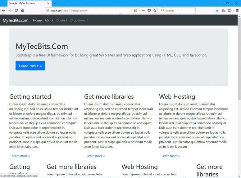
Web Page In Desktop Mode
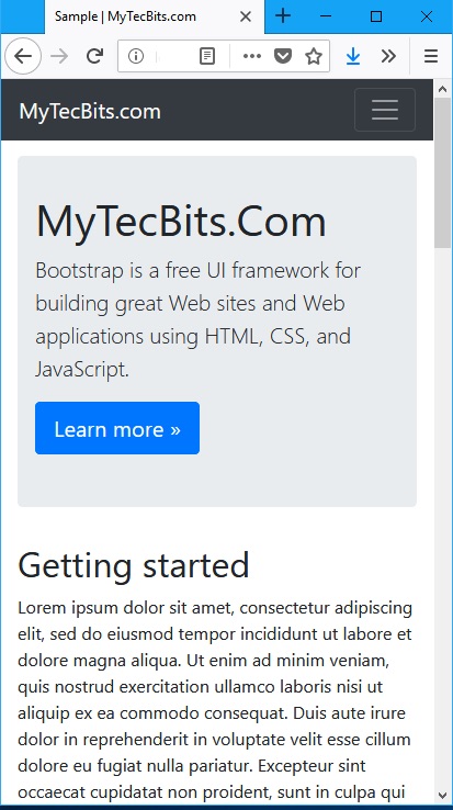
Web Page In Mobile Mode
If you are creating a MVC 5 project using the default MVC template in Visual Studio 2015 or higher, Bootstrap will be already included in the project through a NuGet package. But the default bootstrap will be of older version, say 3.0.0. You have to upgrade the Bootstrap NuGet package to add the latest version of bootstrap in your MVC project.
To upgrade bootstrap, follow these steps.
To know more about using the bootstrap classes with server-side HTML controls and MVC’s HTML Helpers see the section below.
The sample source created for this Bootstrap With MVC article is available in GitHub. Get The Source Code
Create An Empty MVC Project
Add Bootstrap Files To Empty MVC project
Using Bootstrap In MVC
Bootstrap framework is now ready to be used in the MVC project. To use the bootstrap in the project, you have to add a bootstrap template. Bootstrap template is nothing but the bootstrap navigation bar and container.
In a MVC project you can add the navigation bar and container in the Layout file and the bootstrap grid and column system in the views. Follow these steps to implement the template.
- Create a folder named Shared under Views.
- Under the Shared folder, add a layout page named _Layout.cshtml.
- Remove the content in the _Layout.cshtml file and paste the below code. See the highlighted part of the code below. The first block has the 3 meta tags which are required for bootstrap. These 3 meta tags should immediately follow the tag. The next part in the head section is the bootstrap’s css file reference. In the body tag, we will have the navigation bar defined by the class navbar. Then the @RenderBody() is wrapped by the bootstrap’s container class. Finally, we have the script reference for the jQuery and Bootstrap js file. (NOTE: I’m not using the bundling technique for the css and js files in this article. Just like any other css and js file you can bundle the bootstrap css and js files using bundle config and use the @Style.Render and @Script.Render to include the bundled files.) The content of _Layout.cshtml is also available here in GitHub.
To know more about using the bootstrap classes with server-side HTML controls and MVC’s HTML Helpers see the section below.
It’s only a matter of time before a customer taps your site’s URL on their mobile device. Will the user see a rendering of your site that’s impossible to use on a phone because the site was designed for desktop only? If so, that user will most likely move on to a more mobile-friendly site. What if that user could instead encounter a UX designed specifically for a mobile form factor, and enjoy easily interacting with your site?
In the past, a Web site that supported mobile and desktop required different code bases. Today, however, there are UI frameworks that allow a site’s Web pages to support mobile, tablet, desktop and even large-screen desktops—all with a single code base. Though these tools aren’t a panacea for mobile Web developers, they can significantly ease the development process. Still, thought must be given to determine if one is right for your site.
This article presents an overview of one of these tools, Bootstrap, which is included in many of the Visual Studio 2013 Web Application templates. Bootstrap is a framework that enables responsive Web design (RWD)—an approach to designing Web sites that aims to provide an acceptable viewing experience across all form factors with a single code base. After the overview, I’ll consider some factors that can help you decide if a framework like Bootstrap is right for your site.
The Beginning
It has taken a certain amount of evolution to bring the software industry to the point where a solution like Bootstrap emerges. After a fitful start, beginning in 1998, in which Wireless Markup Language (WML), Compact HTML, and XHTML Mobile Profile surfaced and then disappeared, HTML5 finally became the next-generation HTML standard for all devices in 2009. But standards alone aren’t enough. While the standard for mobile Web markup was evolving, significant advances also occurred with hardware, mobile browsers and bandwidth. Processors became faster, mobile browsers advanced to the point where they could display any Web page (even if the page hadn’t been designed for a mobile device), and bandwidth increased. This created an environment for developers to take over.
What Is Bootstrap?
Bootstrap is a responsive UI framework for building Web sites. The Bootstrap framework, like many other UI frameworks for Web development, is a collection of CSS classes, UI components and JQuery plug-ins. Bootstrap is considered a lightweight framework. In other words, it uses CSS more than JavaScript to do its work. Even though Bootstrap is considered lightweight, a Web page that uses Bootstrap tooling still requires more processing to render than a page written specifically for a given form factor. For this reason, performance should be an important consideration when designing, developing and testing pages that use any part of the Bootstrap framework.
Bootstrap does a lot for you automatically. It also allows you to easily customize the default behavior for a specific form factor while keeping your page looking good on other form factors. Version 3 of Bootstrap comes with CSS classes that specifically target browser widths commonly found on mobile browsers, tablet browsers, desktop browsers and even browsers running on large desktop screens. You can use the Bootstrap CSS classes to annotate HTML5 elements. The most commonly used CSS classes involve the Bootstrap grid system, a collection of classes that organize the layout of a page using rows and columns. I’ll describe the grid system in more detail later in this article.
Bootstrap has a number of UI components for creating a site’s UI, including Button dropdown, Button group, Dropdown, Navbar, Breadcrumb, Media object, Pagination and Progress bar, just to name a few. Many of these components are responsive themselves, meaning that they render differently based on the width of the browser. For example, the Navbar is a powerful component that transitions automatically from a menu bar that displays menu options across the entire width of the screen on desktops to a nice-looking compact version that presents options via a dropdown menu bar that’s activated when the user touches the Navbar.
For more advanced UI features, Bootstrap also has a collection of custom JQuery plug-ins, including Carousel, Collapsible panel, Modal dialog prompts and Popover messages.
Getting Started
Experimenting with the Bootstrap Grid System
Bootstrap provides what’s known as a 12-column responsive layout. You can lay out your pages using any number of rows, but you must use 12 columns. These 12 columns are sized equally across the width of the browser and you use the Bootstrap CSS classes to specify how many columns an HTML element should occupy. This is a different type of grid system than XAML developers for Windows Phone and Windows 8 are accustomed to. The XAML grid system allows a page layout to have any number of rows and columns. Developers then place each control in a cell by specifying a row number and a column number. What makes the Bootstrap grid system especially powerful is that you can specify a different column span for large desktops, normal desktops, tablets and phones. For example, a common layout pattern is to create a series of divs and for each div specify that it should occupy 2 columns on a large desktop (this means that 6 divs would fit on each row), 3 columns on a normal desktop, 4 columns on a tablet and 6 columns on a phone (which would produce 2 divs per row). This scenario is coded in Figure 2 using the col* classes that make up the Bootstrap grid system. The color classes (gray, orange and so on) merely color the background of a div. Figure 3 and Figure 4 show how this page would be rendered on a desktop and a phone, respectively.
Figure 2 A Common Layout Pattern Using the Bootstrap Grid System
.jpg)
Figure 3 The Example from Figure 2 Rendered on a Desktop Using the col-md-3 Class
.jpg)
Figure 4 The Example from Figure 2 Rendered on a Phone Using the col-xs-6 Class
It’s important to note that Bootstrap doesn’t actually detect the device type. Rather, Bootstrap uses media queries to determine whether a CSS class should be applied. The four categories of classes are shown in Figure 5, along with the width ranges that will cause each category to be applied.
Figure 5 Bootstrap Grid System Class Categories
| Category Prefix | Form Factor | Width in Pixels |
| col-xs-* | Phone | Less than 768 |
| col-sm-* | Tablet | 768 to 991 |
| col-md-* | Desktop | 992 to 1,200 |
| col-lg-* | Large Desktop | Greater than 1,200 |
You can use any combination of these categories when laying out a specific HTML element. For example, the following line of code uses one class from each category:
This is equivalent to the following pseudo code:
If the browser’s width is less than 768 pixels, then this div will span 6 of 12 available columns, which takes up one-half (6/12) of the screen.
Else if the browser’s width is between 768 pixels and 991 pixels, then this div will span 4 of 12 available columns, taking up one-third (4/12) of the screen.
Else if the browser’s width is between 992 pixels and 1,200 pixels, then this div will span 3 of 12 available columns, taking up one- fourth (3/12) of the screen.
Else if the browser’s width is greater than 1,200 pixels, then this div will span 2 of 12 available columns, taking up one-sixth (2/12) of the screen.
You don’t have to explicitly specify a column count for each category. If you don’t specify a particular category, the next category down in size will be used. For example, if you’d like a unique layout for phones but it’s OK for tablets, desktops and large desktops to have the same layout, you just need to specify a class for phone and tablet. like so:
Bootstrap will use the tablet setting for both the desktop and large desktop form factors. Also, the default class for phone is col-xs-12, which places each div on its own row. If this is an acceptable layout for a phone, the preceding line of code can be further reduced:
Notice in Figure 2 that rows aren’t specified. The Bootstrap grid system will automatically move a div to the next row if the current row has already been used up or if there’s not enough room for the div. You can force a new row by using the row class like this:
Why 12 columns? 12 may sound like a randomly chosen number for this grid system, but it’s not. The number 12 provides a lot of divisibility and a lot of room for composability. For example, the numbers 1, 2, 3, 4, 6 and 12 all divide evenly into 12. Using these values for column spans can produce a content layout of 12 columns, 6 columns, 4 columns, 2 columns and 1 column, respectively. Moreover, combinations such as 3+9, 9+3, 4+8 and 8+4 are visually appealing combinations for laying out content.
Bootstrap Components
Bootstrap contains more than 20 components, which can be used in their current state or easily extended. Check out the Bootstrap site for a description of each component and a usage example. The documentation for the media object even makes use of an REO Speedwagon music video to demonstrate its use. Even if you didn’t grow up during the 80s, consider giving it a listen.
I’ll take a closer look at the Navbar component, which is used to create a menu bar at the top of a page. Figure 6 shows how to use the Navbar component to create a simple menu that contains a site’s brand and a few menu options. When a browser’s width is wider than 768 pixels, the Navbar is rendered as shown in Figure 7. If the browser width is smaller than 768 pixels, the Navbar is rendered as shown in Figure 8. In this case, the menu options are displayed when the user taps the button containing the horizontal lines.
Figure 6 Using the Bootstrap Navbar Component
.jpg)
Figure 7 The Navbar Rendered for Browser Widths Equal to or Greater Than 768 Pixels
.jpg)
Figure 8 The Navbar Rendered for Browser Widths Less Than 768 Pixels
Obviously, this is a very simple example. The Navbar can also contain dropdown menu buttons, and you can even incorporate search functionality in the Navbar. Also, the Brand portion of the Navbar, which is text in the example, can be an image.
JQuery Plug-Ins
Bootstrap has about a dozen JQuery plug-ins, which are documented under the JavaScript tab at the Bootstrap site. At first glance they look similar in function to the components described in the previous section in that they’re CSS classes that are used to augment HTML5 elements. However, these CSS classes trigger JQuery activity when the HTML element is rendered or when various events fire off the HTML element. Pages that make heavy use of these plug-ins should be tested for performance issues, especially on devices with slower CPUs and limited memory.
The JavaScript needed to run these plug-ins is located in bootstrap.js. Each plug-in is also available as a standalone file, which enables you to include only the plug-ins your app needs, resulting in faster first-page rendering.
Figure 9 shows how to use the Carousel plug-in, which provides slideshow functionality. If your page already has a link to bootstrap.js or bootstrap.min.js, you’re all set. Or you can link to carousel.js if the Carousel plug-in is the only plug-in your page requires.
Figure 9 Using the Carousel Plug-In
Figure 10 shows the Carousel plug-in rendered for Windows Phone. The Carousel plug-in stretches itself appropriately for tablet, desktop and large desktop form factors.
.jpg)
Figure 10 The Carousel Example Rendered in the Windows Phone Emulator
Considerations
As I noted earlier, Bootstrap won’t be right for every situation. To determine if Bootstrap is right for your site, there are a few things you’ll want to consider:
- If you have an existing site that has been performance-tuned over the years and has been optimized for your users, you’ll want to proceed with caution. Prototyping complex, highly used pages is also a good idea. If a Bootstrap-enabled page doesn’t perform adequately, consider setting up an m-site and coding everything yourself. Dino Esposito’s article, “Mobilize an Existing Web Site” (bit.ly/1CaVEWR), shows how to set up an m-site.
- If you’re building a new site, prototype your most complex pages and the pages you believe will be most heavily used. Make sure they work well on low-end devices and in areas of low bandwidth. If a page proves to be problematic then try to redesign it such that it will perform adequately. An m-site is also an option for new sites, but this should be done only if a redesign will not work.
- Make sure that the Bootstrap grid system and the components used for navigation aren’t too limiting with respect to site design. Check with your UX designers early in the process of investigating Bootstrap. In my opinion, a tool like Bootstrap forces you to design for mobile, which forces you to keep your pages clean and uncluttered. However, your UX designer can confirm whether Bootstrap can be made to properly represent your brand and provide an experience suitable for your users.
More Information and Tools
If you’re going to develop your site using Bootstrap, you’ll want to review all the components and JQuery plug-ins documented on the Bootstrap site, where you’ll also find many useful examples. You should also check out:
Wrapping Up
The material presented here is just a brief overview of the Bootstrap UI framework. It by no means completely describes all the CSS classes, components and plug-ins that come with Bootstrap. You’ll want to go to the Bootstrap site to get a complete understanding of all the tools available, and to explore the sample pages that demonstrate different UX designs. These samples are a good place to start if you need to get a feel for what’s possible with Bootstrap.
Before moving forward with a serious development effort using Bootstrap or any other framework, do consider performance and usability. Prototyping key pages is the best way to confirm that Bootstrap can be incorporated into your site and give you the results you want.
Thanks to the following Microsoft technical experts for reviewing this article: Rick Anderson and Cephas Lin
1. LibMan (LibraryManager)
The libman.json file is the Library Manager manifest file which contains the all the libraries (ie. packages) along with their destinations that are installed in the application.
Note that you will find the Bootstrap reference in it.
- 1. Cleaning Client-Side Libraries
- 2. Restoring Client-Side Libraries
- 3. Update Client-Side Libraries
- 4. Uninstall Client-Side Libraries
Cleaning & Restoring Client-Side Libraries
Cleaning & Restoring Client-Side Libraries can be done quite easily by right clicking on the libman.json file, and it will show up these 2 options. Simply select the needed option to perform the task.
I have shown this in the image below:
Update & Uninstall Client-Side Libraries
- 1. Open the libman.json file and then click on the client-side library which you want to uninstall or update.
- 2. You will see a light yellow bulb icon appearing on the left side. Click on this icon to get the options for – whether to update or uninstall that specific client-side library. I have shown this in the below image.
Note: You can also uninstall and update the a client-side library by ‘removing or changing it’s version no’ on it’s entry in the libman.json file and then saving the file.
When you are using Visual Studio 2017 or earlier versions then Bower is a perfect choice to install Bootstrap Package in your application.
To add Bootstrap to the project I will first need to add Bower Configuration File (bower.json) . So right click the project in the solution explorer and select Add ➤ New Item .
The bower.json file will be added and will open for editing in Visual Studio.
Right click the ‘bower.json’ file in solution explorer and select Manage Bower Packages . See the below image for this:
The ‘Manage Bower Packages’ window will open up. Here you click the Browse Tab and on the search box type – ‘bootstrap’.
The bootstrap option will show up on the section that is below the search box. Select it, then on the right side choose it’s latest version and click the Install button to add Bootstrap to your project.
The below image shows this:
In a few seconds time Bootstrap package will be downloaded and ready to be used in your project.
If you open the bower.json file, you will find the bootstrap entry is added inside the dependencies section:
Note that adding of client side libraries can also be done manually by first downloading them from their respective sites and placing these downloaded files in your website’s wwwrooot folder.
With this you are ready to harness the power of Bootstrap in your application. Just add the link to bootstrap css in the _Layout.cshtml file and you are good to go.

Получаем простую, обозримую и легкую заготовку для создания своих веб-приложений на VS2017 с использованием Vue.js и TypeScript. Привычная среда разработки, в которой можно выполнять большую часть кодинга и отладки, а также быстрая пересборка приложения, делают работу вполне комфортной.
В генерации JavaScript-кода приложения принимает участие только штатный компилятор TypeScript и VS2017, что сильно сужает круг подозреваемых при возникновении глюков. А это, в свою очередь, — тоже большая экономия времени и нервов.
Содержание
Попутно настроим сборку и бандлинг приложения из командной строки через dotnet bulild , dotnet bundle .
Как видите, в чистом виде "сообразить на троих" не получается — каждый участник процесса норовит притащить свою компанию. Самое удачное, что получилось, хотя бы на время, избавится от Webpack, который тащил за собой много чего.
В этом tutorial сделаем порядком надоевшее приложение AppHello. В дальнейшем его можно будет заменить на своё. Для этого будет достаточно заменить ts-файлы, html-шаблоны и css-файлы.

Для данной статьи на github размещено решение VS2017 с проектом TryVueMvc. В это решение планируется добавление других проектов — просьба не обращать на них внимания.
Создание стартовой болванки

Установка NPM пакетов
Определяем конфигурацию NPM (менеджера пакетов Node.js). Для этого добавляем в проект файл конфигурации NPM под именем package.json.
Нам нужны пакеты Vue, SystemJS и Bootstrap4. Последний, в свою очередь, требует jQuery и Popper.js.
Обычно новые NPM-пакеты после изменения в package.json устанавливаются автоматически. В противном случае — вызвать команду восстановления пакетов принудительно.
Настройка бандлинга и минификации
В создаваемом приложении отказываемся от использования CDN (Content Delivery Network или Content Distribution Network), используемые библиотеки внешних поставщиков собираем в бандлы, минифицируем и помещаем в wwwroot/dist/.
Внешние библиотеки разбиваем на 2 части: vendor1 и vendor2 (он же vue). Сборку app-bandle.js делает TypeScript, поэтому здесь его только минифицируем.
| Файлы бандлов | Источники | minfy |
|---|---|---|
| vendor1.js +vendor1.min.js | node_modules/jquery/dist/jquery.js, node_modules/popper.js/dist/umd/popper.js, node_modules/bootstrap/dist/js/bootstrap.js, node_modules/systemjs/dist/system.src.js | true |
| vendor1.css | node_modules/bootstrap/dist/css/bootstrap.css | false |
| vendor1.min.css | node_modules/bootstrap/dist/css/bootstrap.min.css | false |
| vendor2.js +vendor2.min.js | node_modules/vue/dist/vue.js | true |
| app-bandle.min.js | wwwroot/dist/app-bandle.js | true |
| app-templates.html | ClientApp/**/*.html | false |
| main.css +main.min.css | ClientApp/**/*.css | true |
Создаем пустую папку ClientApp, т.к. она указывается в bundleconfig.json (иначе будет ругань). Файл bundleconfig.json уже должен быть в проекте, остается его только правильно настроить.
После сохранения изменений bundleconfig.json, в каталоге wwwroot/dist должны появиться бандлы от vendor1 и vendor2. Бандлы нашего приложения появятся после создания необходимых исходных файлов.
Настройка компилятора TypeScript
Если параллельно планируется использовать Webpack или другие системы сборки, то лучше использовать tsconfig.json. Добавляем этот файл и настраиваем по приведенному образцу.
Создание и сборка AppHello
В нашем примере используется вариант организации проекта, когда CSS-файлы не являются собственностью отдельных компонент, а определяются для всего приложения централизованно.
Создаем папку ClientApp/css для общих css-файлов. Создаем папку ClientApp/components для ts-файлов и html-шаблонов компонент. В каталоге ClientApp создаем файл index.ts, используемый как точка входа в приложение. Добавляем остальные файлы клиентского приложения AppHello.
Читайте также: